As indicated earlier, uniforms fascinate me. I thought my brother and I were pretty much on an island on this topic until I came across Paul Lukas and his wonderful "UniWatch" blog. I check this site every day for his take on all things uniform-related. He and I share an preference for stirrups in baseball uniforms, a hatred of purple, and basic traditionalism in general.
An examination of the uniform sets worn by all five teams follows: Home, Road, Alternate, "Special," etc.. Your comments are greatly appreciated, as the analysis is done completely by me and follows my tastes and my tastes only.
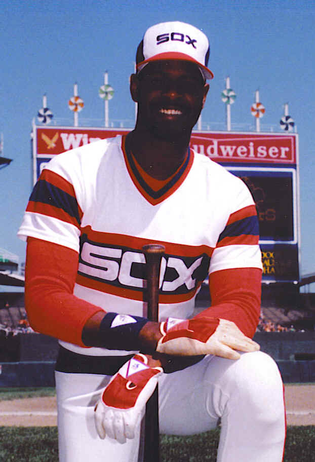
Chicago White Sox:
- Home - All and all, a good set. The black pinstripes on the home uniform look sharp, and the olde English lettered "Sox" on the front is great. I could definitely do without the number on the front. A classic look.
- Road - Awful! The piping down the pants has always bugged me and they just always looked like softball unis when pitted against their home set.
- Black Alternate - The one which started all the current madness......The Sox debuted this one back in the early 90's and they were deemed lucky during Chicago's 1993 march to the division title. Therefore, what was designed to be a Sunday home game special was used more often throughout the season. Many teams realized the merchandising opportunity of debuting a third jersey, and quickly drew up plans. Hell, I even bought a Sox black jersey for myself! I don't mind it much - it sticks with the same pattern as the home version, just removes the pinstripes and does a solid black. Again, I could do without the number on the front. Also, if they would just stick with the Sunday-only treatment, I'd accept these.
- Summary - For a team which, for a while, could not settle on a uniform set and pioneered bad taste, the current White Sox set is decent. The home look is becoming a classic; the road is genuinely awful; the overall impact is average.
- Ranking - 6 of 10 (negative points for the road jerseys outweigh high marks for the home set)
- Home - Solid and relatively clean. They used to look a lot redder, but now they are more balanced.
- Road - These are rather nondescript. Nothing major to impress or annoy.
- Blue Alternate - Yawn.......clean in that it follows the home version, but nothing to write home about.
- Sleveless Alternate - Get rid of it! Stupid!
- Throwback - Here we go....we were building up to this. What a fantastic uniform! Simple, traditional, classic. This was a wonderful introduction to the uniform set for the 2008 season and the Tribe should adopt it as its permanent home uniform today. Love the simple block lettering, the cream color, and the traditional caps. Bravo!
- Summary - The throwbacks are the story here. What a great set.
- Ranking - 7 of 10 (Almost entirely due to the throwbacks)
- Home - Classic. One of the best in all sports. When you think olde English 'D,' you think of the Detroit Tigers. This design has not changed much since Tiger Stadium (nee Briggs Stadium and Navin Field) was brand-new. The Tigers simply don't believe in messing with tradition.
- Road - The road uniforms have changed over the years, but the current set is certainly better than the one it replaced and its goofy cartoon cap. The script "Detroit" is classic in its look and they haven't put a lot of bells and whistles on the jersey to screw it up.
- Summary - The Tigers' uniforms are iconic in baseball circles. Also, the fact that they do not have an alternate jersey is refreshing.
- Ranking - 10 of 10 (Home uniform far and away accounts for any shortcomings of the road uniform. Also, the absence of an alternate set gains bonus points)
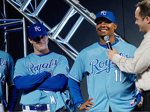
- Home - Classic look. Clean, crisp, and refreshing. I love blue and white as uniform colors (the Royals and Dodgers are two of the best in all sports, in my opinion), and Royals have taken steps in the last few years of getting rid of the black outlining on their home jerseys and sticking with a clean and classic look.
- Road - These are great as well. Again, basic grey with the clean lettering makes for a great uniform set. Thank goodness they ditched the black.
- Dark Blue Alternate - It's ok. Nothing fancy here - just a dark blue version of the home set. Of course, if you already have a classic look, who needs an alternate?
- Light Blue Alternate - This set was introduced in 2008 due to popular demand in an effort to re-connect with the great Royals' teams of the mid-70's to the mid-80's. I've always felt some nostalgia toward the powder blue look - I always thought it looked best on the Royals' uniforms - and KC was one of the last teams to switch to road greys. This was a good addition to their set.
- Summary - Great uniform, hands-down. Love blue and white as primary colors.
- Ranking - 9 of 10 (Just a point off for the dark blue alternate, but a great set overall)
Minnesota Twins:
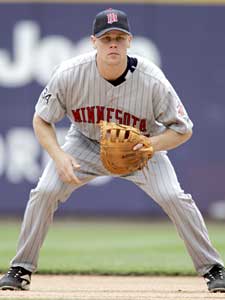
- Home - Not a huge fan of these, but you have to give the Twins points for tradition. They adopted the current home and road uniform set prior to the 1987 season - we all know how that ended - and have been largely unchanged over the years, but for some minor modifications. The pinstripes are fine, but the typeface could use a little updating.
- Road - Dump them....now! The grey pinstripe look sucks. Period. Keep the current typeface and lose the pinstripes, and you have a nice uniform.
- Alternate - Ho-hum. At least they dumped this set before the 2009 season began (needless overkill to have two blue alternative jerseys). The blue alts are fine, but nothing special. They're certainly better than the red jerseys they sported in 1996, and one ended up in my closet for I believe $15.
- Sleveless Alternate - Dump them....they suck...the team plays indoors, so who needs a sleveless jersey? Besides, Livan Hernandez preferred this look when he pitched at home in 2008.
- Throwback - A big hit! The 1982 Twins were 60-102, but they always looked good in uniforms similar to the ones pictured. The '82 team did not have button-downs, and there were some other modifications, but this set is awesome! The red hats look surprisingly good with this collection, and the no-names-on-back (or "NNOB" for those who read UniWatch) is a fine touch.
- Summary - Not a bad set, but the Twins may indeed look to change things up for 2010 when they move outdoors. Ditching the sleveless jerseys, losing the pinstripes on the road, and changing the typeface on the home jerseys (or, just adopting the throwbacks as their home uniforms) would be a great start.
- Ranking - 7 of 10 (Road jerseys drag the grade down; the throwbacks are fabulous; the sleveless alternate has to qualify for a points-deduction)
To quickly summarize, best-to-worst in the AL Central:
- Detroit
- Kansas City
- Cleveland/Minnesota
- Chicago
Vote for your favorites in the poll on the left-hand side and we'll see if you agree with my tastes.
I am personally a fan of the road uniforms. I think the pinstripes make the road unis unique (I can't think of another team with the gray pinstripes) while retaining tradition (white at home, gray on the road). I also appreciated the blue alternates (more or less same reasoning). The throwbacks... it wouldn't hurt my feelings to never see them again. The Twins sucked, the music sucked, and the jerseys sucked. Please don't make me think about that era existing anymore.
ReplyDeleteI agree the Tigers have the best unis, hands-down- love the classic look.
ReplyDeleteI prefer the Twins go back to the 1965 look. Love the cursive "Twins" script on the home pinstripes and the solid greys.